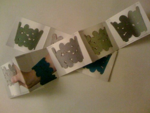
After a lengthy photo-editing session, I started working on my mini-catalog. Its in the form of a little accordion fold-out booklet. I decided to keep the catalog simple and graphic, with the focus on the images. When I send them to retailers, I'll include a cover letter and info sheet. I've still got a few minor changes to make, but I need to order them from the printer in the next day or two. What do you think?

Working on the mini-catalog also gave me an idea for the layout of the website. I did this quick little mock-up in Illustrator, but I've still got to build the whole website. So more to come on that later...

Working on the mini-catalog also gave me an idea for the layout of the website. I did this quick little mock-up in Illustrator, but I've still got to build the whole website. So more to come on that later...


1 comment:
I think it looks great -- simple & clear. The reader sees what it is and what it does without a lot of bullsh!t text, etc. Nicely done, Megan.
Post a Comment